US Bank

Orbit Virtual Payments

The challenge
The kids are playing -- and paying -- in a virtual world... and the parents are struggling to keep up. A bank wants to test the feasibility of a centralized, transparent payment and budgeting app for video gaming products across multiple platforms for multiple family members.
My role
As design lead, I worked through two rapid iterations of research and design to explore the desirability of a new product concept. I collaborated closely with a strategist, supporting designer, and project manager from my own team, as well as a product owner and two VP’s from US Bank’s innovation team.
Balancing autonomy and transparency
Children are spending more social time in virtual gaming worlds where real money is necessary to make purchases. Their parents feel overwhelmed by frequent small monetary requests and the difficulty of supervising virtual play. Children, in turn, feel frustrated by their lack of financial autonomy and the need to rely on their parents.
Research phase 1: do parents and children really want an app for this?
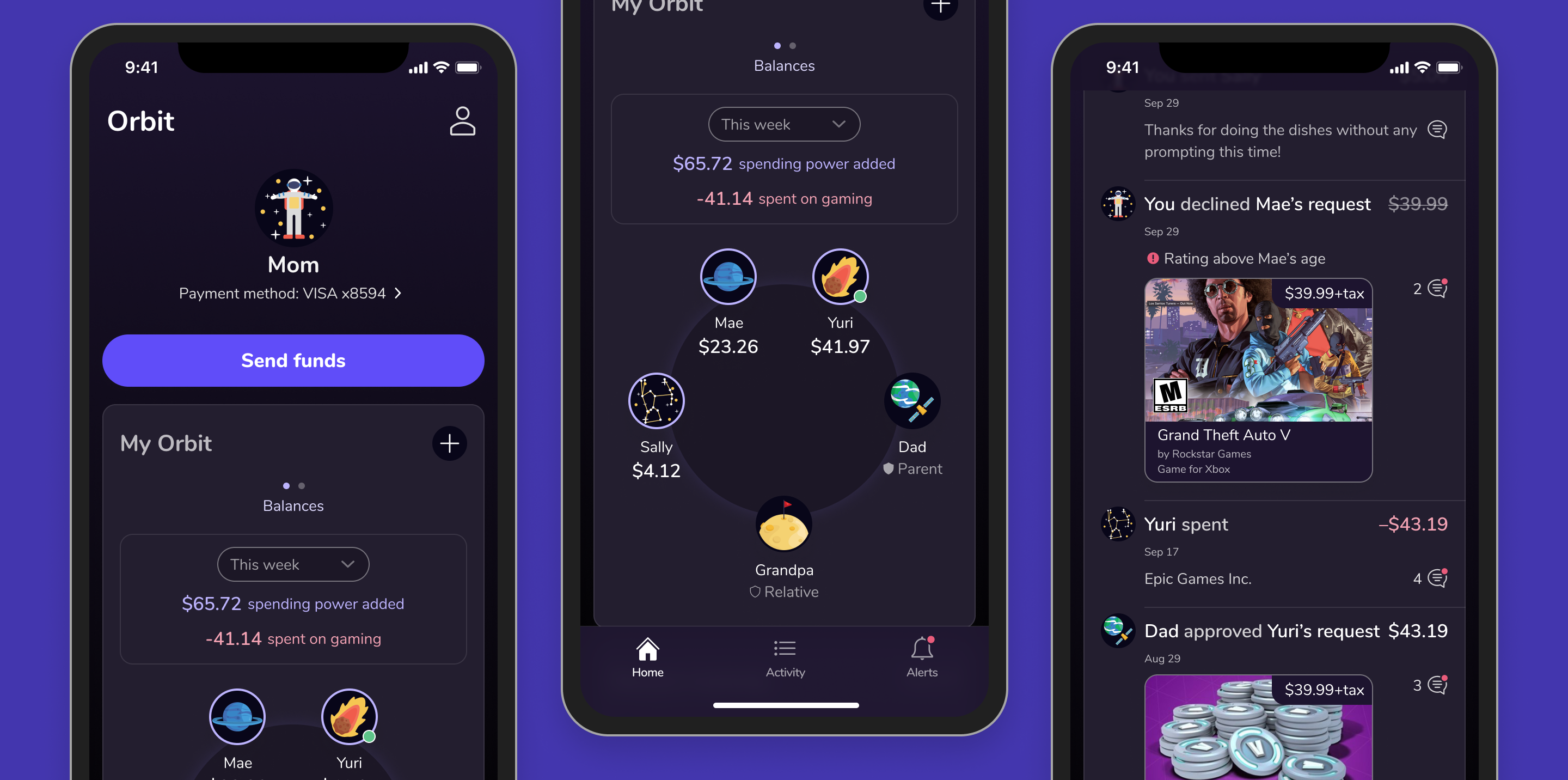
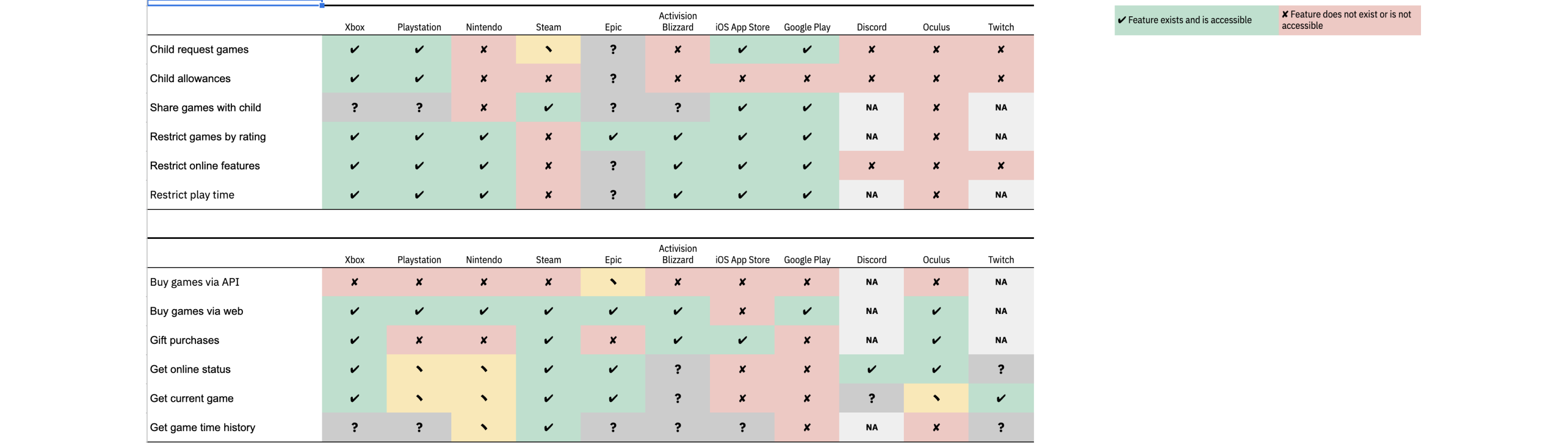
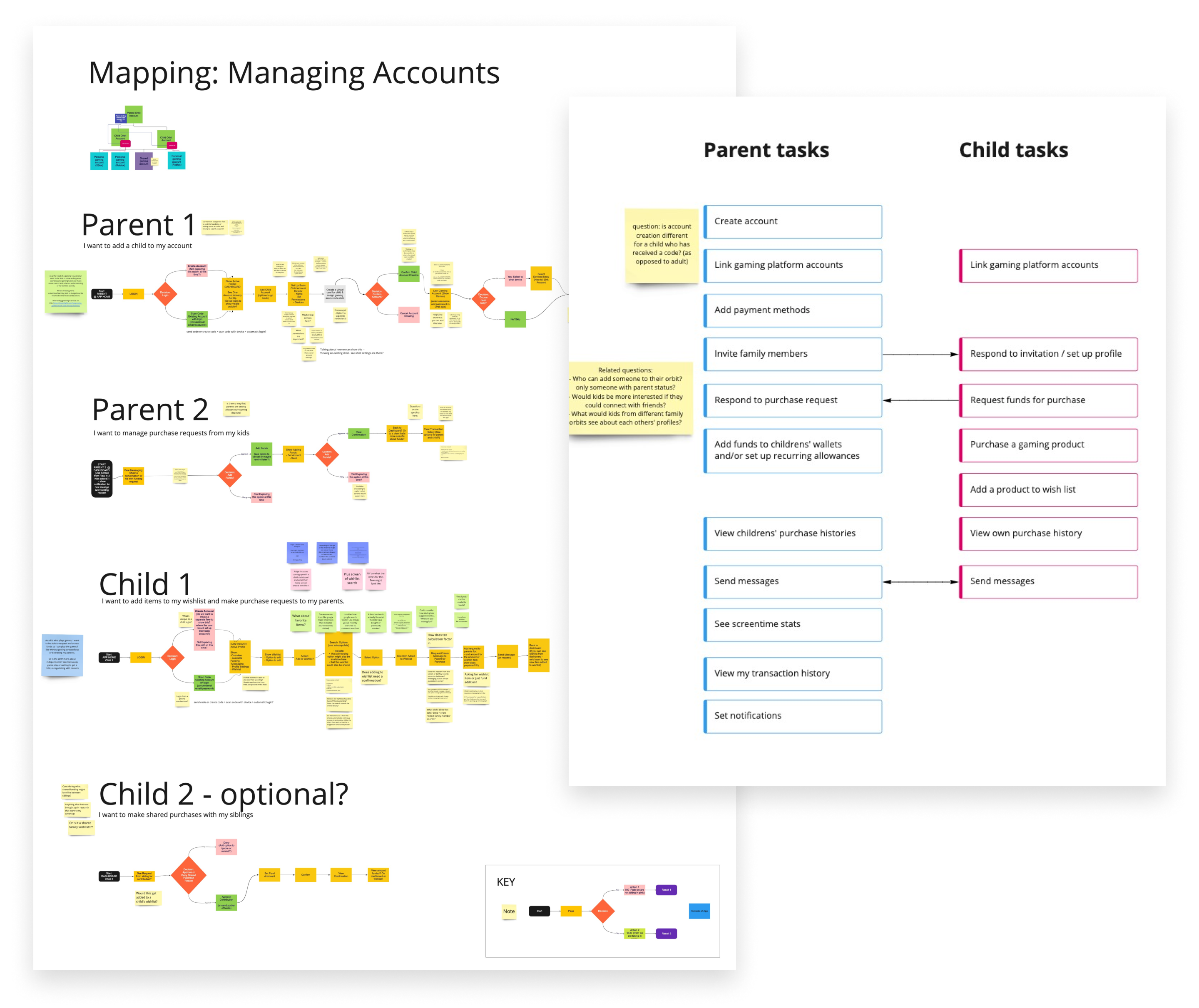
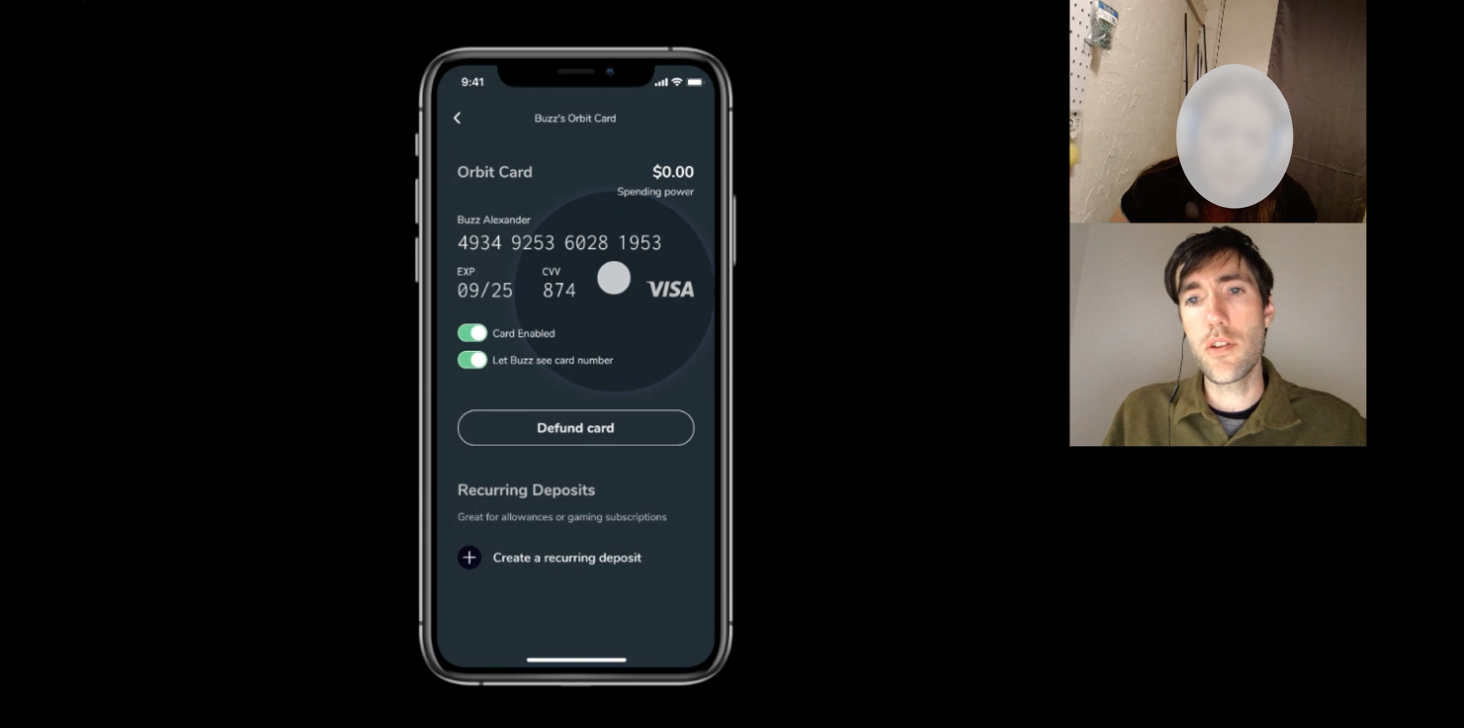
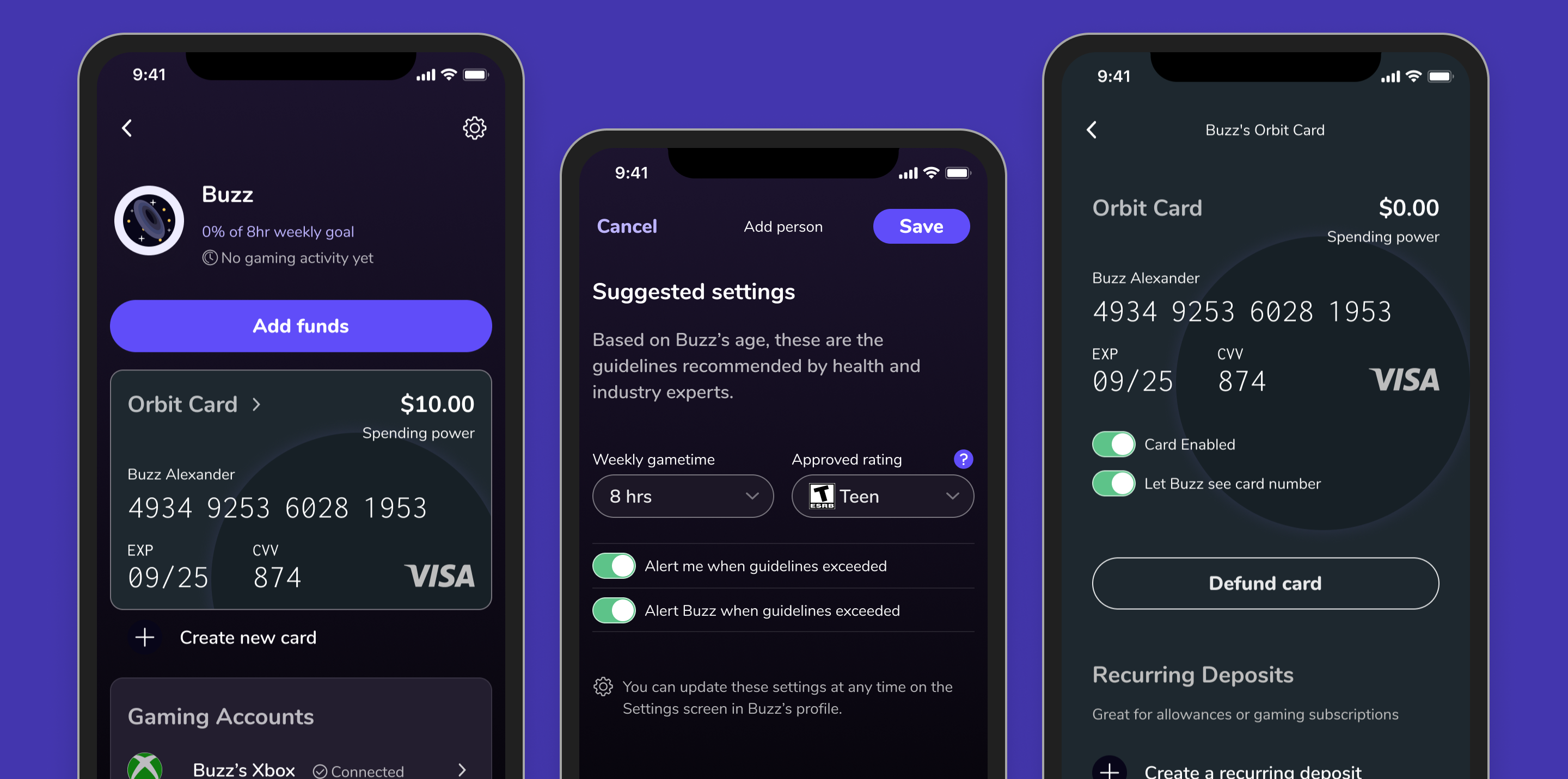
We started with the hypothesis that a single centralized app-based payment system could integrate with multiple gaming platforms, giving family members the ability to seamlessly exchange funds for use on any connected platform. In addition, we could give parents oversight of how funds were being spent, where their children were playing, and perhaps even who they were playing with.
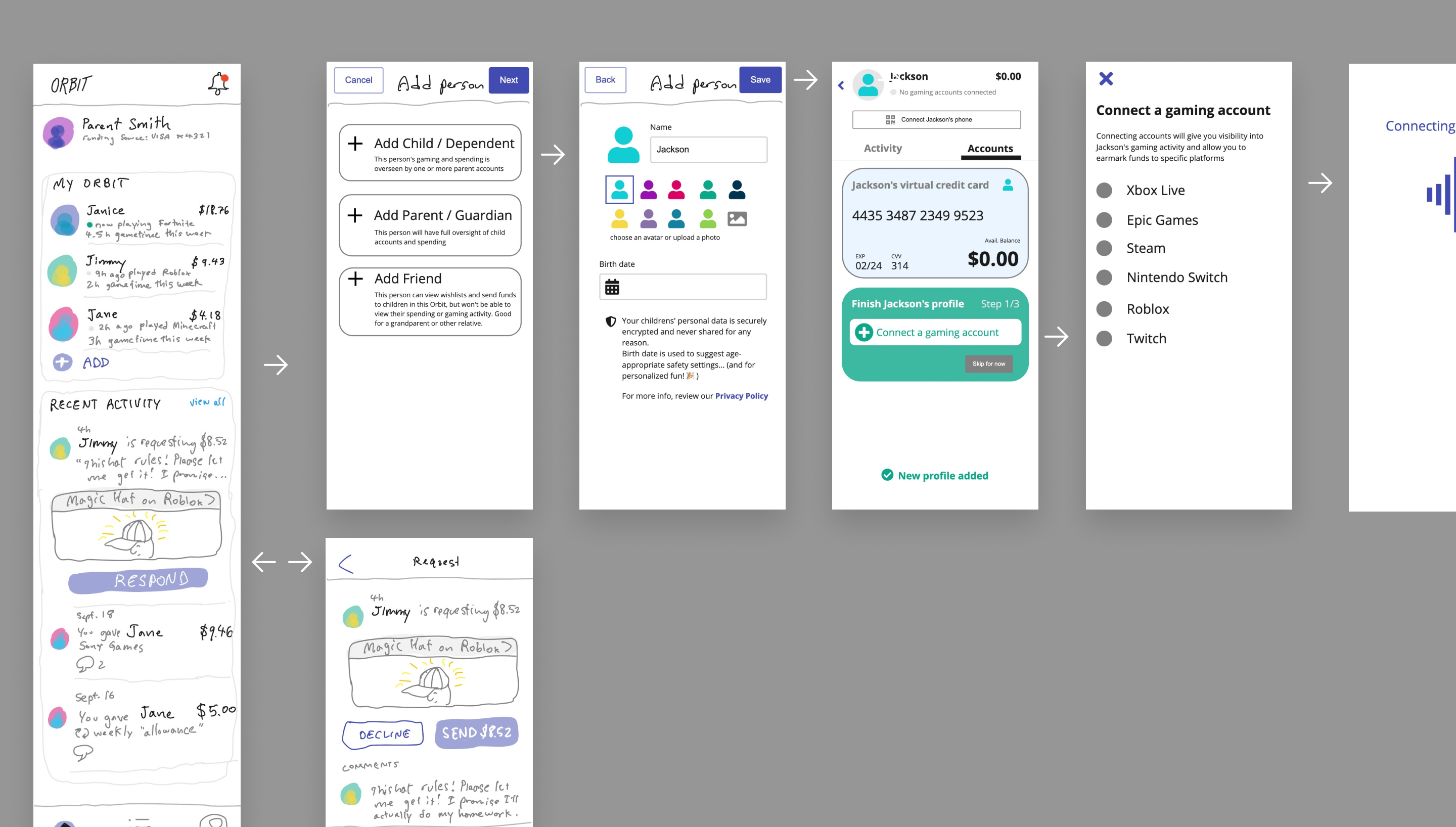
For our first round of user interviews, we asked parents and children around the country questions about their gaming habits and household payment rules, and then we showed them images of a high level concept prototype to solicit feedback. Our goal was to determine whether our problem hypothesis was accurate and whether an app-based solution was desirable. We were skeptical that children would be willing to share the details of their gaming lives with their parents. To our surprise, both child and parent participants were enthusiastic about the idea.
Research phase 2: will they understand how to use it?
To prepare for our second phase of research, we wanted to create a realistic prototype that would address the technical problems of integrating with “closed garden” gaming platforms. We weren’t sure whether the deep integration we envisioned would be possible. With the help of technical colleagues, we identified opportunities for gameplay integration, but had to pivot to a ‘virtual credit card’ model for payment due to lack of direct payment APIs.
Our research questions for our second phase focused on the viability of a new technical solution for payment and whether we could create an intuitive, usable experience for both parents and children. Would our cool concept still seem appealing with an added dose of reality?
Scoping a testing-sized solution
With knowledge of technical constraints in hand, our design process started with a list of core tasks for both parents and children, as well as identifying where those tasks intersected. We began creating user flow charts, looking for a flow that would provide the best example for our research questions.
Adding detail to refine interactions
From our established flows, we sketched rough wireframes. During this process, we were able to refine our concept of messaging. As we began to visualize transaction activity in a timeline format, we realized that commenting on specific events would be more useful to family members than simply messaging. After all, anyone with a smartphone already has at least one habitual way to directly message their family. It’s the association of that message with a request, transaction, or gaming event that would give value to this app.
User interviews put assumptions to the test
We interviewed parents and their children separately, letting them test an onboarding workflow and following a scripted set of questions about their understanding and overall impressions.
Synthesizing research and finding patterns
Members of the team contributed qualitative notes to a shared board, while quantifiable answers such as Likert scale ratings of different features were captured on a spreadsheet for easy comparison. I led the creation of a 25-page findings document comprised of insights, quotes, and data from the interviews.
Insights and learning
It was exciting to see strong evidence of support for our initial hypothesis, and the project has entered a technical proof of concept phase.
During our second phase of research, we got some important insights into usability pain points and hierarchy reorganization that need refinement for the next iteration. Removing one step from the financial onboarding flow would have eliminated most of the misunderstandings that users expressed. However, I’m proud of how far we go with just a few weeks of design work, and how positive the audience response was.
Next case study