Telehealth Onboarding

Zipnosis
The challenge
As demand for remote healthcare surges in 2020, a white-label telehealth platform needs quick usability improvements for first-time users.
My role
I led a design audit of the existing platform, and in the process created a framework for design audit documentation that has been in use by the Foundry team ever since. I collaborated with a second product designer to conduct usability tests and create design recommendations
Why are new patients having trouble completing their visits?
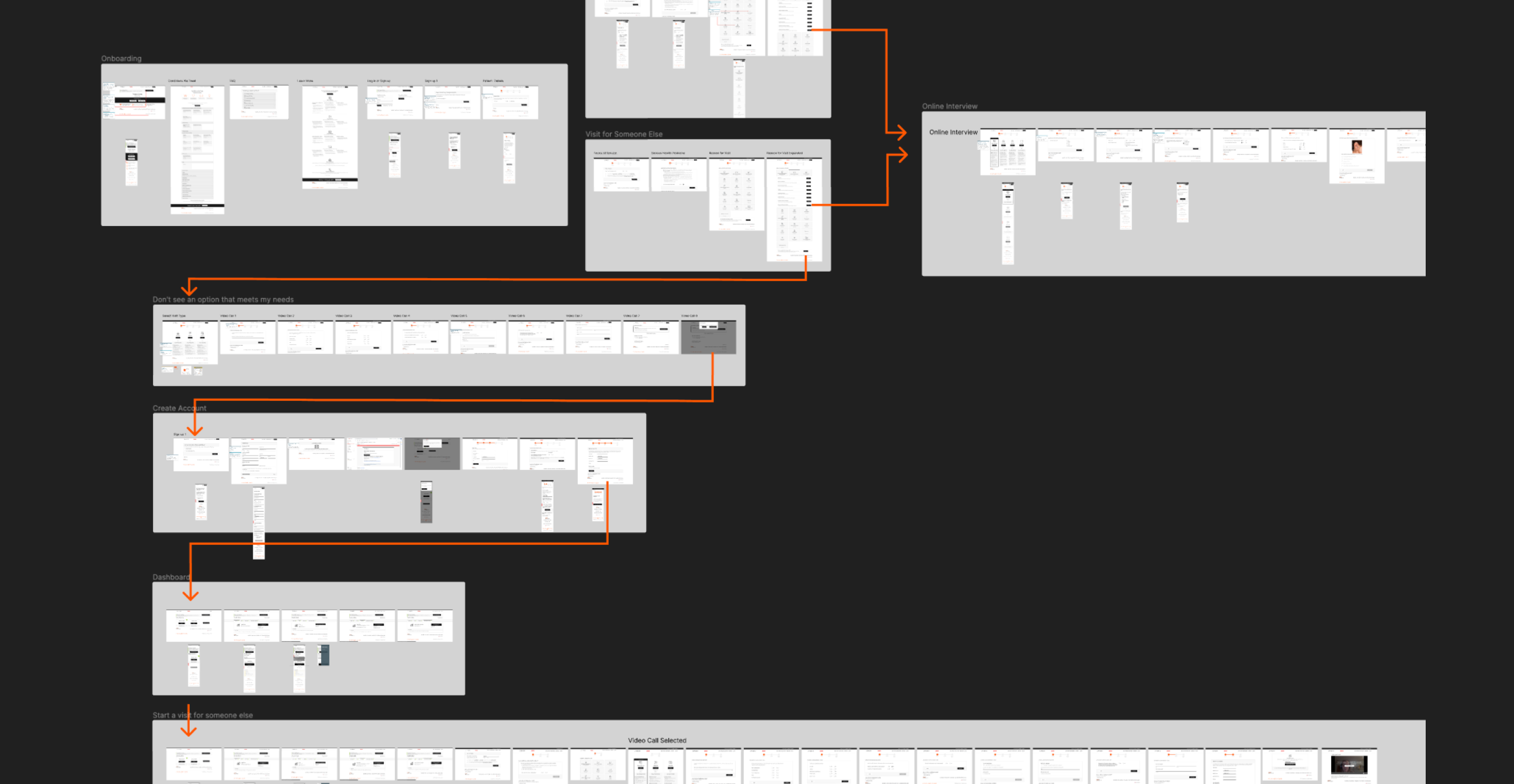
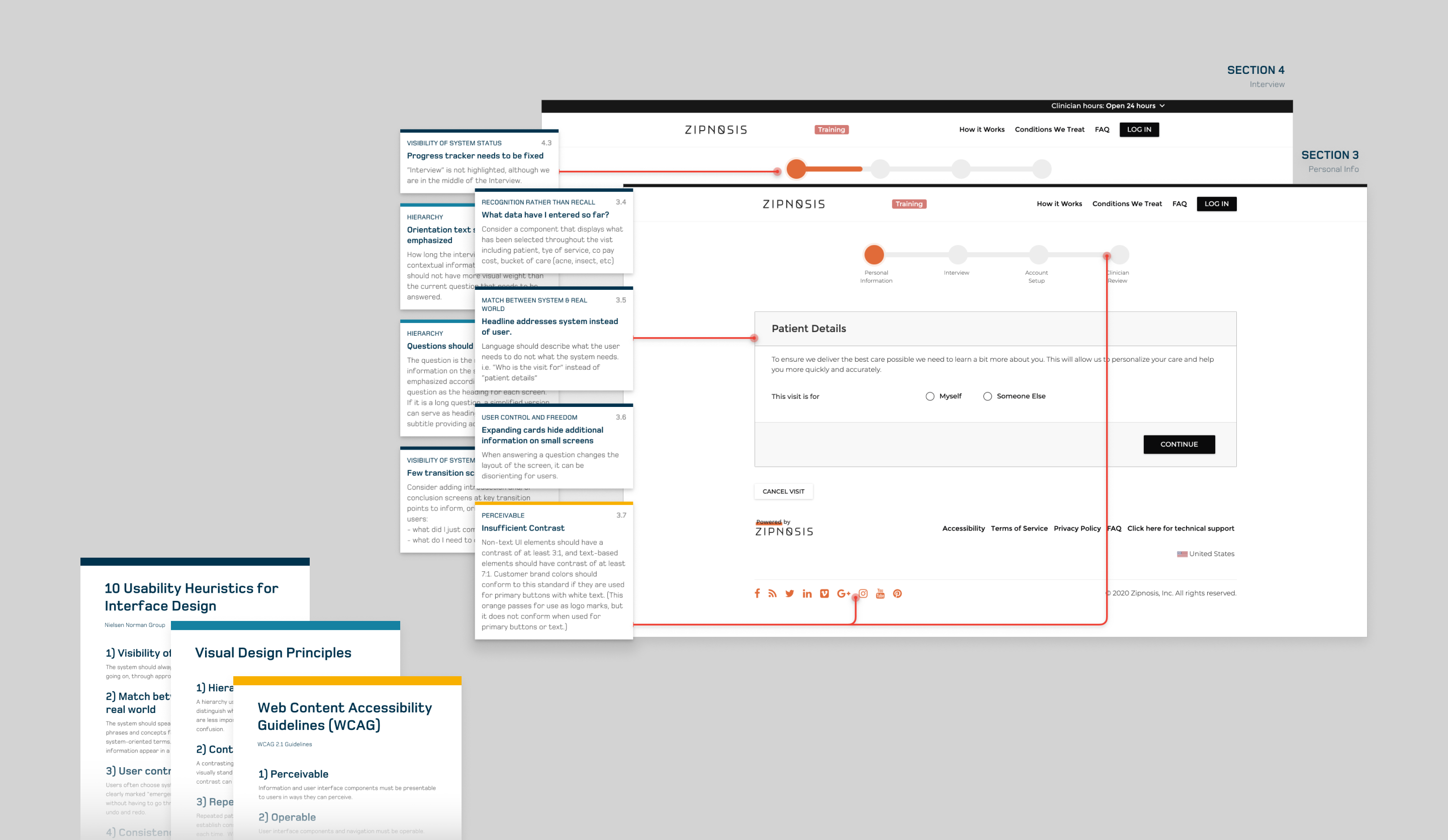
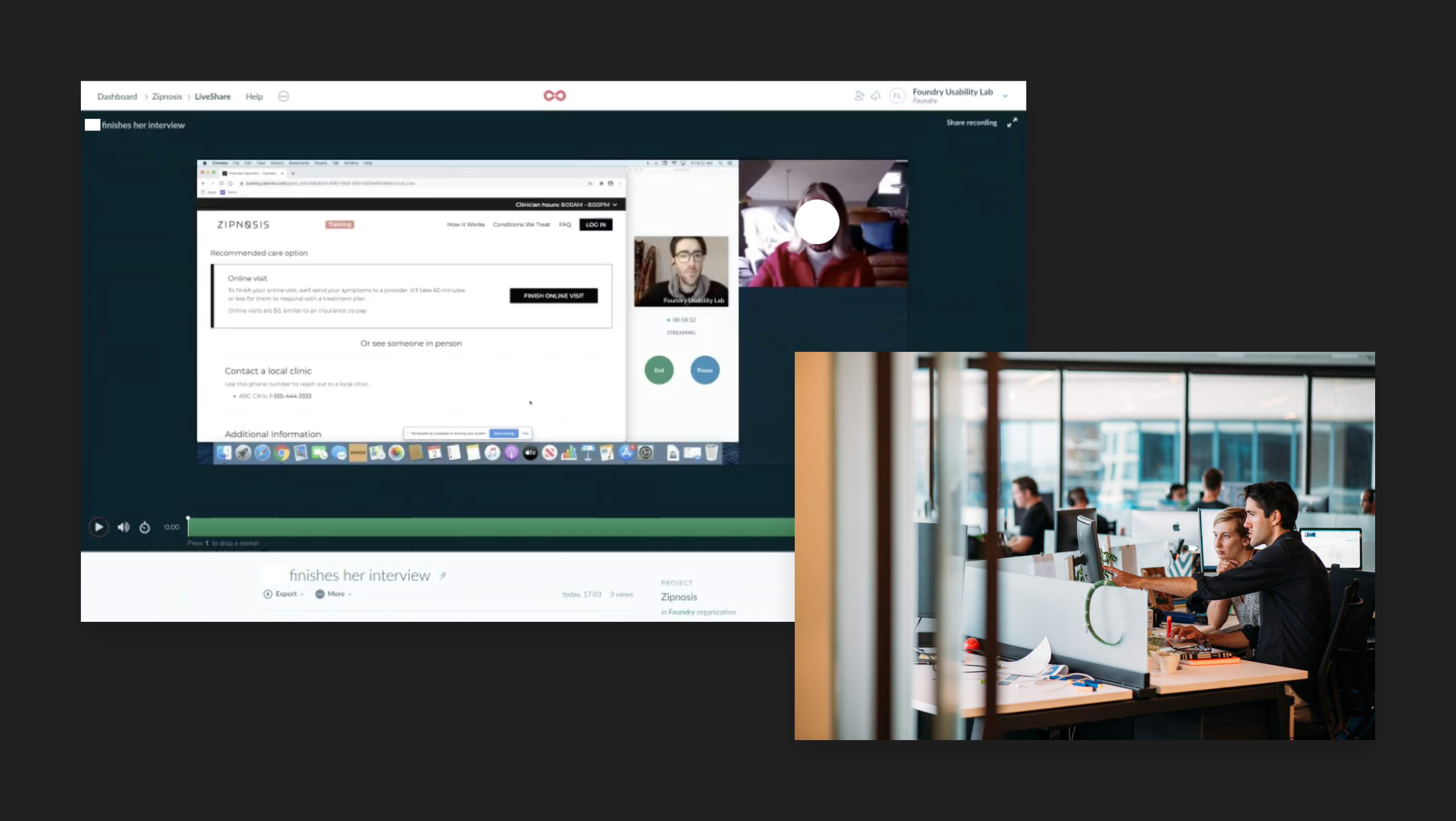
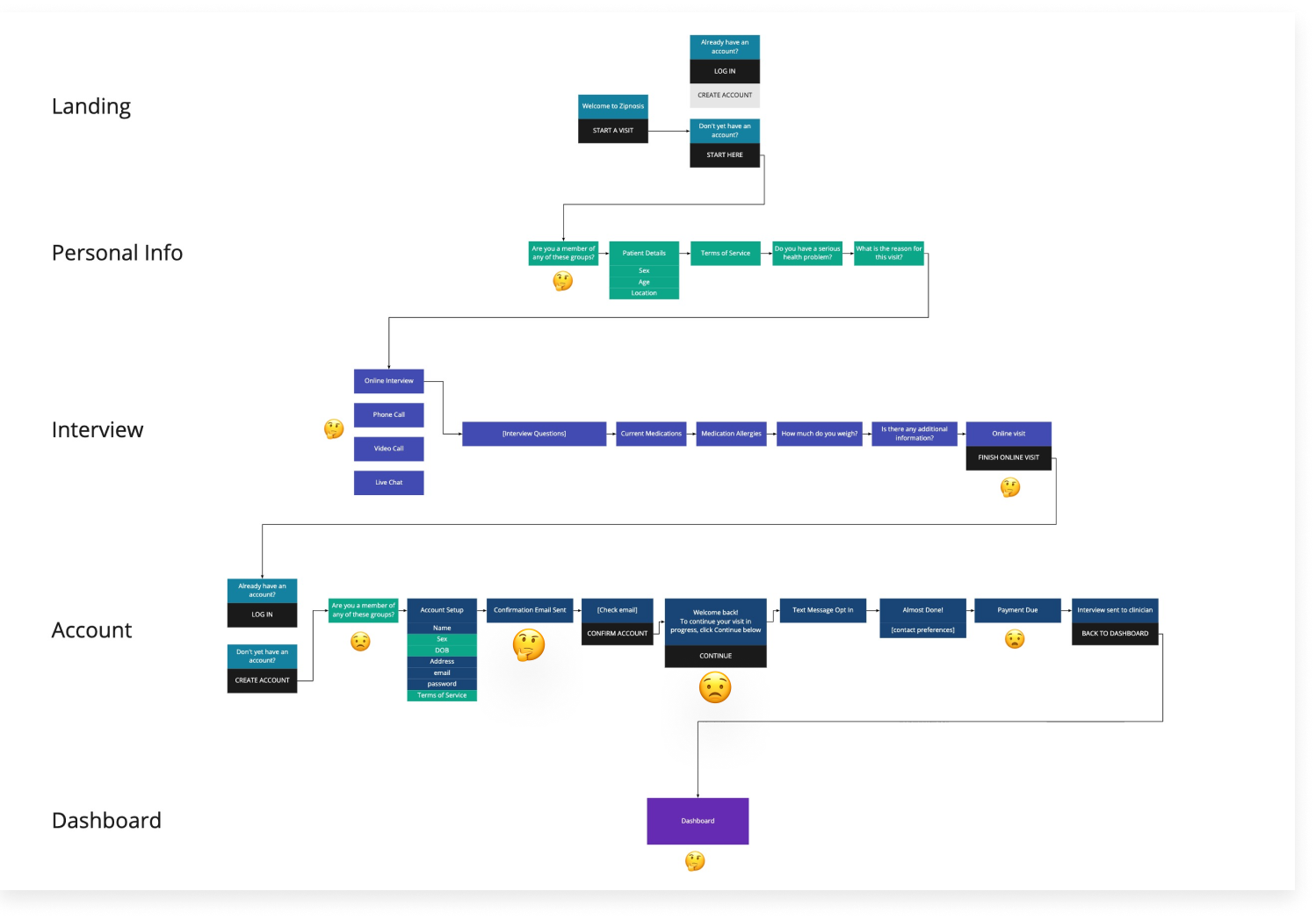
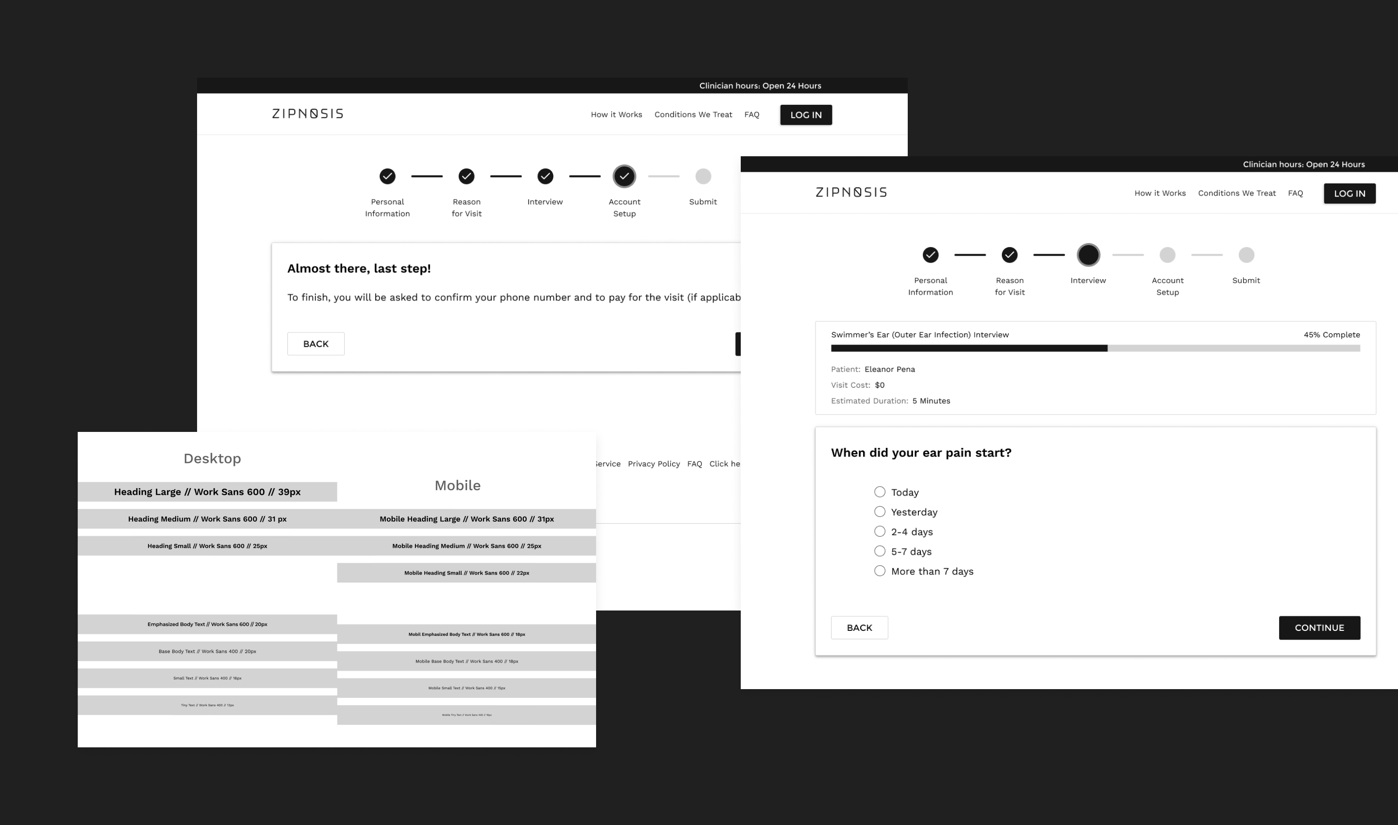
The Zipnosis platform is widely used by healthcare institutions to connect patients with clinicians. The product not only schedules appointments and facilitates video and phone visits, it also uses dozens of customizable diagnostic questionnaires (an “interview”) to direct patients to appropriate care. Usually, an interview is a patient’s first contact with Zipnosis -- they’re worried about their health and they click a link for virtual care on their clinic’s website. However, somewhere in the process of completing the interview and creating an account, users are having trouble, abandoning their sessions at high rates.
With such a robust and complex system, the client couldn’t go back to the drawing board and redesign their app. They needed advice on systematic design improvements that could be applied throughout the product and improve overall usability.
Exposing the big picture by checking the details.
My audit aimed to expose system-wide design issues that could contribute to user error or confusion. Using Jakob Nielsen’s Usability Heuristics, a customized set of basic visual design principles, and the W3C Accessibility Standards, I looked for patterns and annotated representative screens with findings.
Getting a real-world perspective from older users
I collaborated with a teammate to create a testing script and conduct usability tests of the existing system with users over the age of 60. We knew that this was the group encountering the most difficulty, and wanted to focus on gathering insight from them.
Their moments of confusion corresponded with some of the pain points identified in the audit, and emphasized a key point: UX writing needs to address the user, not the system status. There were a few key moments where clearer copywriting in larger text could have made the difference between failure and success.
Designing new patterns by designing a few screens
With the results of the audit and usability tests in hand, we prioritized a series of design recommendations, wireframing a few representative screens to demonstrate how the revisions to key patterns could be applied across the entire product.
Back to Portfolio