Mobile Crop Transport

Conservis
The challenge
Farm workers and truck operators need to track production tasks and harvest transport with a simple interface that’s easy to use on the go. With most field equipment already equipped with tablets, our design needed to be tablet-first but phone friendly.
My role
I led design of the mobile application while supporting design of the admin tools that would receive and configure the mobile app’s data. I was assisted by another designer, and frequently worked closely with the client’s product owner and director of engineering.
Collect data without making it feel like data entry
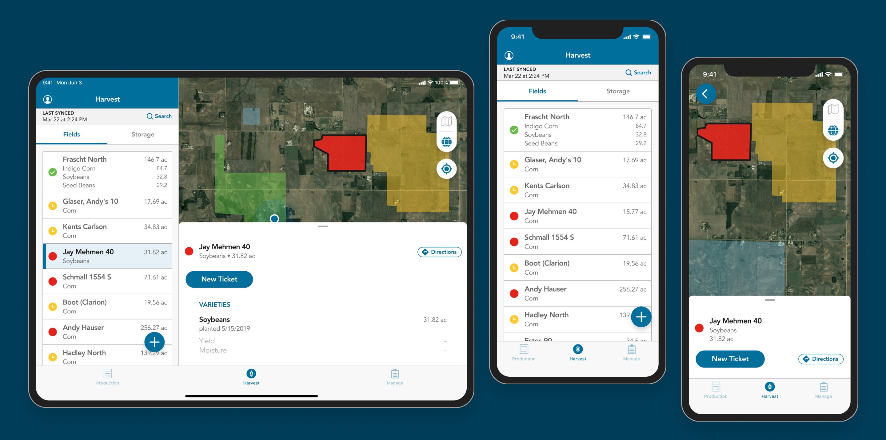
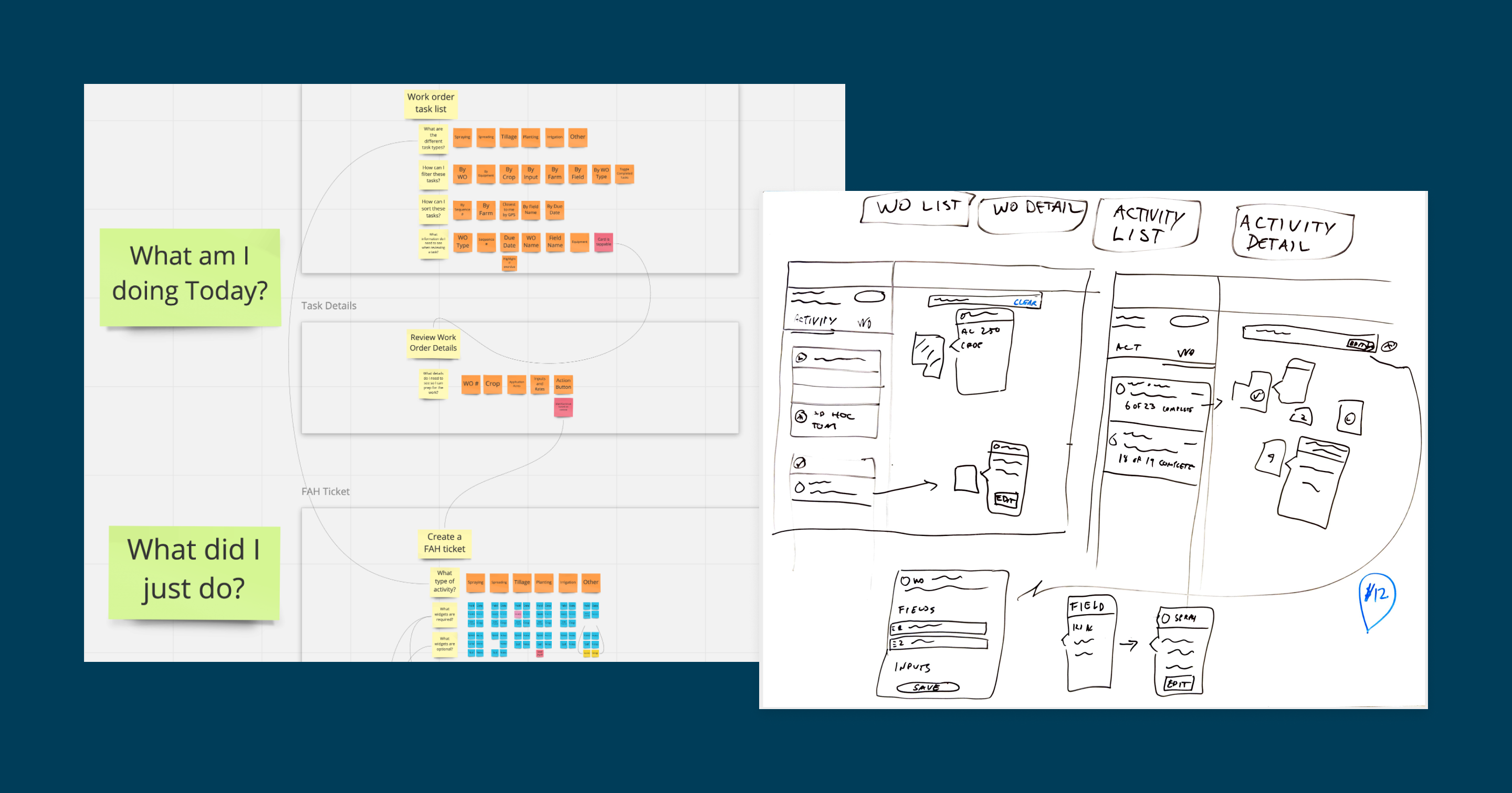
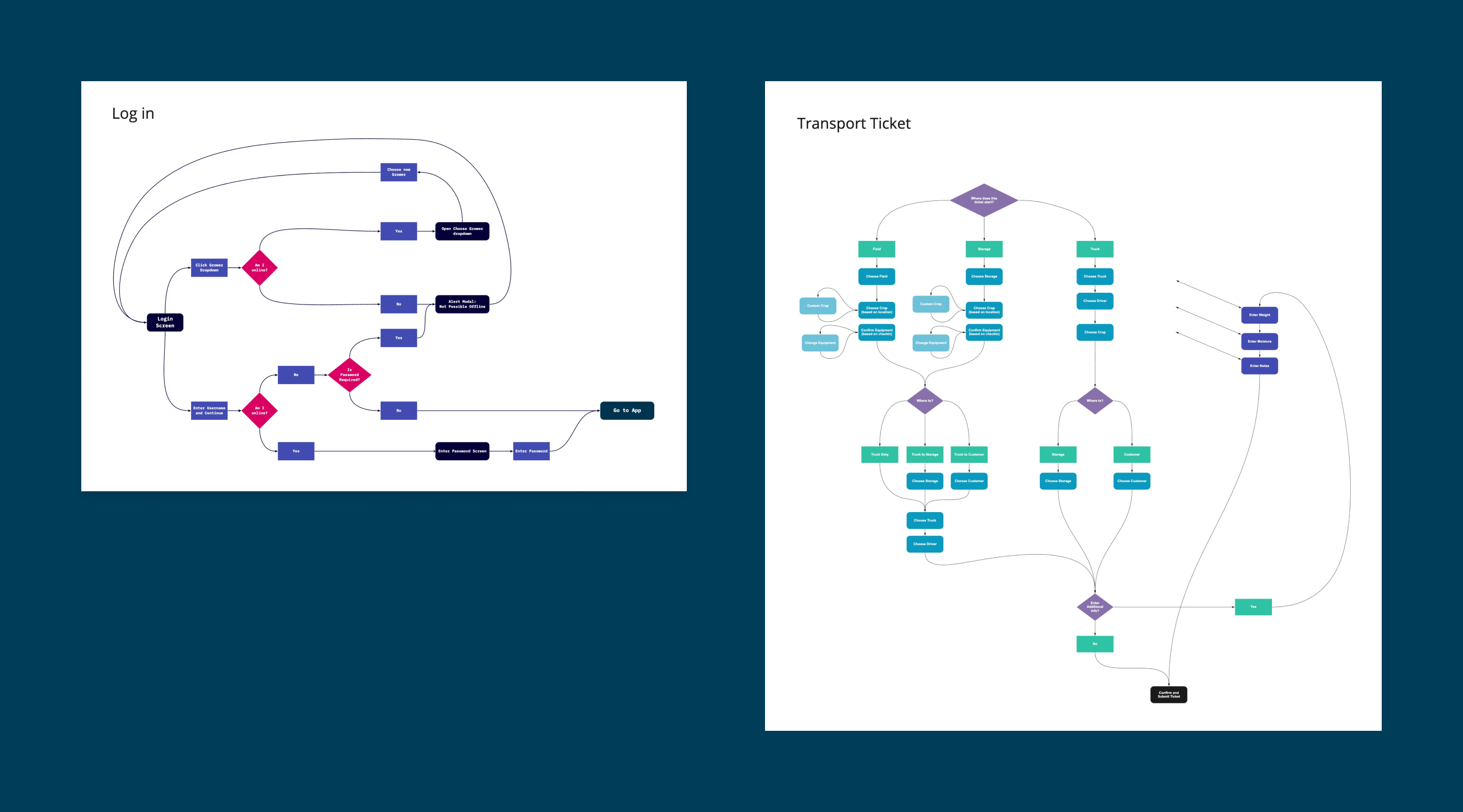
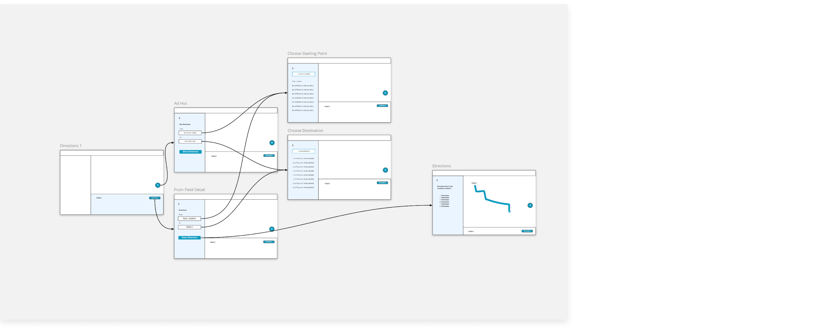
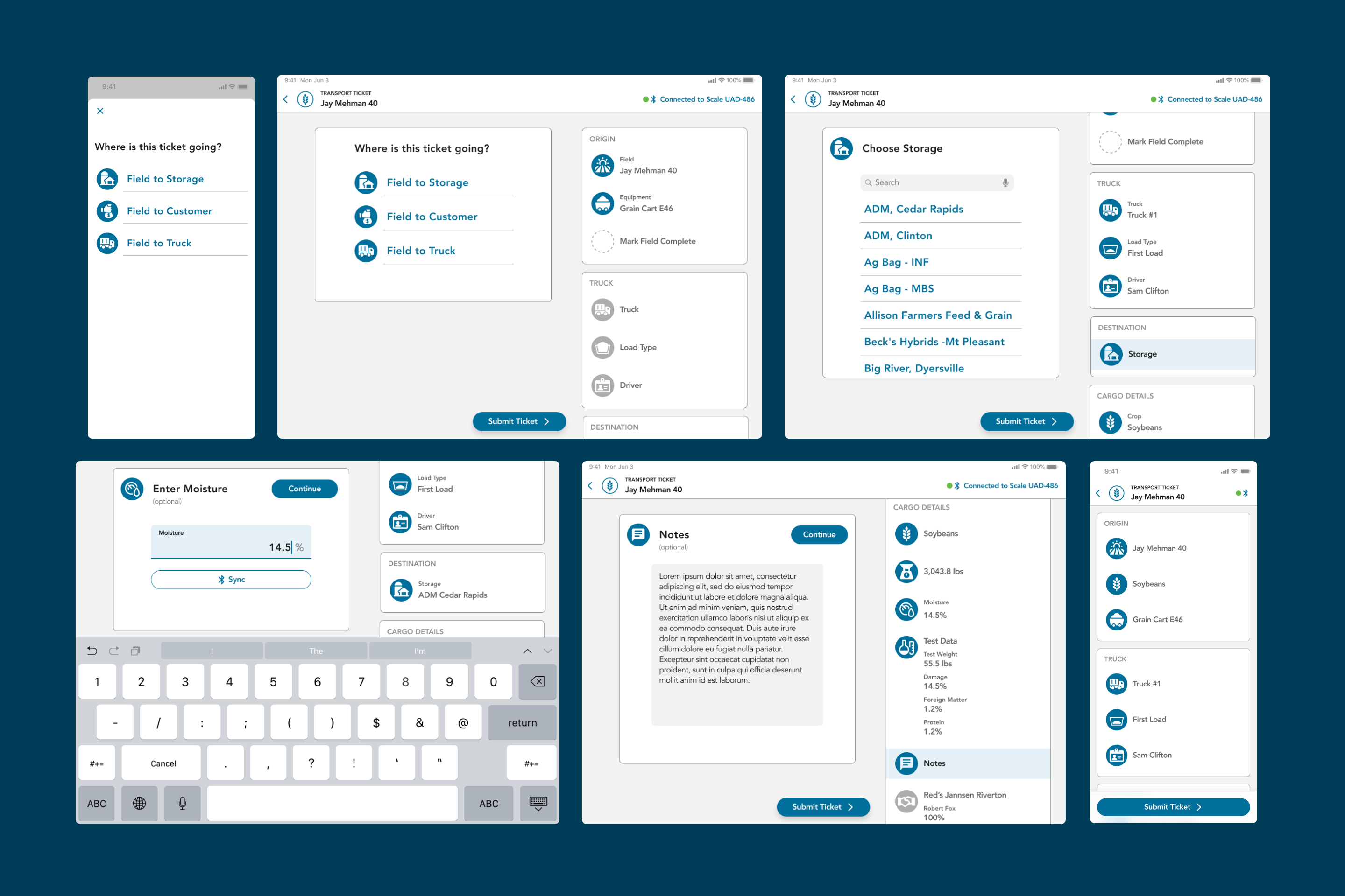
Modern farm employees need to keep a digital record of almost every task -- both for the record-keeping of the business, and for legal food safety compliance. What field did I apply fertilizer to, and how much? Which field needs to be harvested next?
A flexible pattern for logging these task details was needed, with the flexibility to enter information in the order it happens to be available that day, save progress, and submit only when ready.
What are the user's activities and questions?
I collaborated with a product owner and team members who had done field research to catalog users’ day to day workflows and goals. We needed to ensure we were providing (and asking for) answers to the right questions at the right times.
What data can the system accomodate?
Understanding the data points in the existing back end helped to determine what was technically feasible as we started to whiteboard initial concepts.
Aligning with developers via high level flow charts
Because of the unique conditions of farming (unstable cellular connections, overlapping business entities) even our log in workflow had to accomodate numerous use cases. Before creating wireframes of any given feature, simple flow charts were an important tool for reaching an understanding with the development team and ensuring that requirements were being met.
Tradeoffs: overview vs detail
Some stakeholders expressed concerns that the long sidebar menu resulted in too many hidden items “below the fold.” A quick prototype of how expanding cards might work allowed us to demonstrate a possible solution and discuss the tradeoff in a more concrete way. Ultimately, we all agreed that the added complexity was not worth the “everything at once” summary view. Sometimes a simple scroll is easiest.
Answering questions with a single tap instead of navigating menus
At the end of the day, the top priority was making sure that workers could complete their data entry tasks simply from the cab of a moving tractor. I designed a ticketing system that lets workers answer most questions with a single tap. Their answers are recorded in a summary list that lets them easily scan their responses and return to any item. The same patterns and visual language can be used to record any number of tasks, from planting, to irrigation, to harvest.
Next case study